

RedKalion
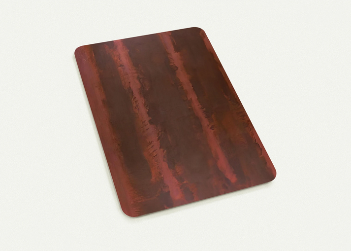
Black on Maroon - 1958 By Mark Rothko Pack of 10 Post Cards | Mark Rothko Post Cards | A6 (10.5 x 14.8 cm) - 4.1 x 5.8 inches
Black on Maroon - 1958 By Mark Rothko Pack of 10 Post Cards | Mark Rothko Post Cards | A6 (10.5 x 14.8 cm) - 4.1 x 5.8 inches
Couldn't load pickup availability
Immense Depth in Miniature: Mark Rothko's Black on Maroon (1958)
Experience the profound emotional resonance of the Color Field movement with this premium pack of 10 postcards featuring Mark Rothko’s seminal work, Black on Maroon (1958). Originally commissioned for the Seagram Building in New York, this piece represents a pivotal shift in Rothko's career, moving away from bright hues toward a somber, meditative palette of deep burgundies and shadowy blacks. At RedKalion, we ensure these subtle shifts in pigment are captured with absolute fidelity.
Museum-Quality Reproductions
Unlike standard inkjet reproductions, our postcards utilize 12-color fine art printing technology. This advanced process allows for the nuanced reproduction of Rothko's layered glazes, ensuring that the 'inner light' of the artwork is preserved even in an A6 format. Each card is printed on 200 gsm (80 lb) FSC-certified paper, offering a substantial, premium feel that reflects our commitment to archival longevity and environmental responsibility.
The RedKalion Standard
Our commitment to excellence means every postcard in this set features a smooth matte finish to eliminate glare, allowing the viewer to appreciate the texture of the composition from any angle. Whether used for thoughtful correspondence or as a curated gallery wall, these prints serve as an archival masterpiece that endures. Elevate your collection with a piece of art history, meticulously reproduced by the definitive curators of world-class fine art prints.
- Artist: Mark Rothko (1903–1970)
- Title: Black on Maroon (1958)
- Material: 200 gsm matte paper (0.26 mm thickness)
- Eco-Commitment: FSC-certified, printed on demand
- Format: Pack of 10 flat post cards


Discover Unlimited Art Possibilities
At RedKalion, you can find virtually any artwork from any artist, available in a wide range of sizes to perfectly match your space.
If you didn’t find what you’re looking for, contact us at support@redkalion.com . We will source any artwork and produce it in any size and format you need, including art prints, posters, canvas, framed pieces, framed canvas, and more.
For dedicated art enthusiasts, we also offer handcrafted replicas of any artwork, carefully painted by highly skilled artists using traditional techniques.
For custom requests, contact us at support@redkalion.com .
What printing technology is used for these Mark Rothko postcards?
We use 12-color fine art printing technology, which provides superior color vibrancy and tonal depth compared to standard 4-color printing, ensuring the subtle maroons of Rothko's work are accurately represented.
What are the physical specifications of the paper?
Each postcard is printed on 200 gsm (80 lb) paper with a thickness of 0.26 mm. The paper features a smooth matte finish for a sophisticated, glare-free display.
Is the paper used for these prints environmentally friendly?
Yes, all our reproductions are printed on FSC-certified paper, ensuring that the materials are sourced from responsibly managed forests that provide environmental, social, and economic benefits.
How long will these postcards last without fading?
RedKalion uses archival-grade inks and acid-free paper, ensuring that your fine art postcards maintain their color integrity and vibrancy for decades when kept out of direct sunlight.
Is there a minimum order requirement for these cards?
No, our postcards are printed on demand with no minimum order requirements, allowing us to maintain a sustainable, zero-waste production model.
What was the historical context of Rothko's 'Black on Maroon'?
Created in 1958, this work was part of the Seagram Murals commission. It marked Rothko's transition into a more somber, architectural style intended to create an immersive, contemplative environment.
Why did Rothko use such dark colors in this series?
Rothko moved toward darker palettes like maroon and black to evoke deep, universal human emotions and a sense of the 'sublime,' shifting the focus from visual aesthetics to spiritual experience.