
RedKalion
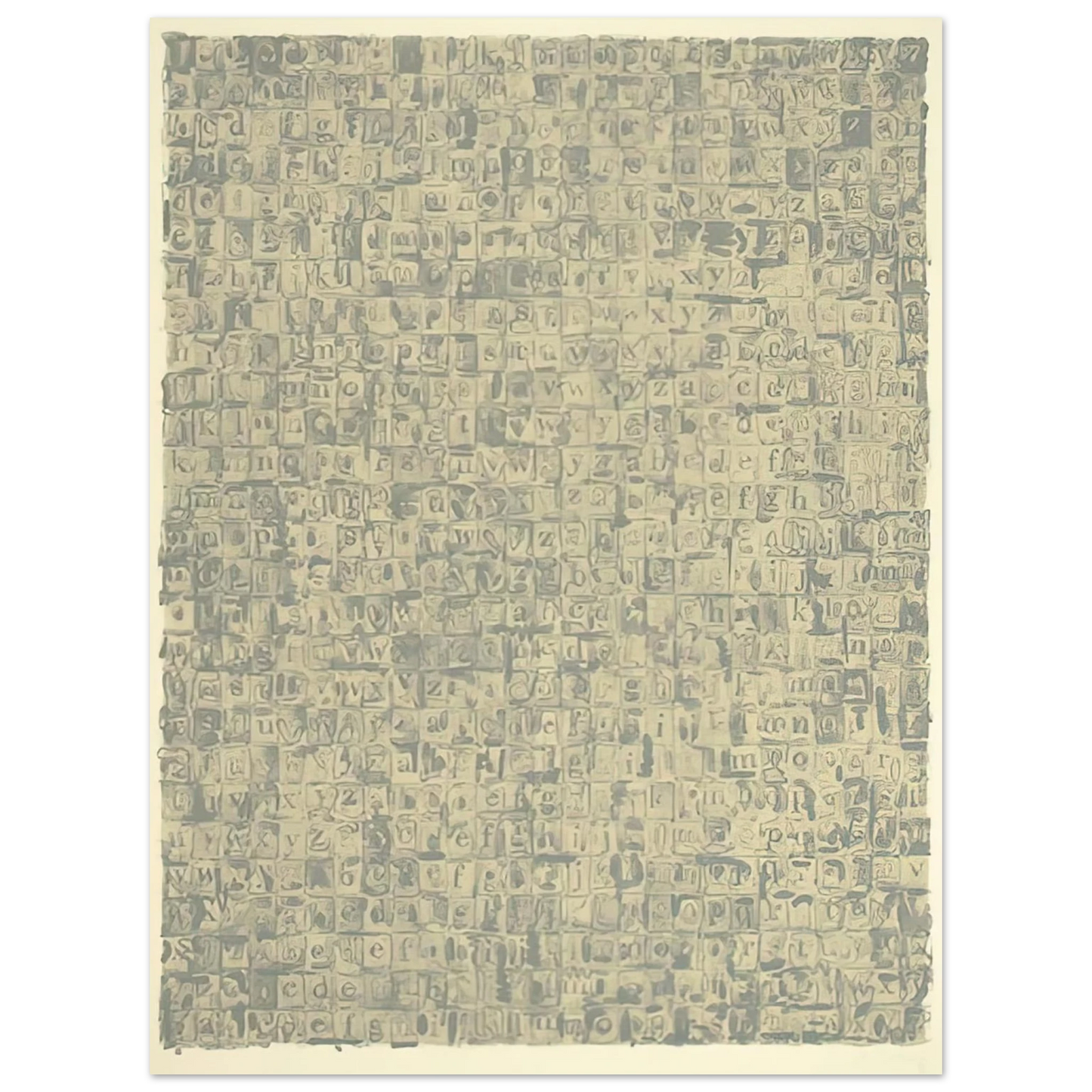
Jasper Johns - GRAY ALPHABETS ULAE 57 1968 75x100 cm / 30x40inches Fine Art Poster
Jasper Johns - GRAY ALPHABETS ULAE 57 1968 75x100 cm / 30x40inches Fine Art Poster
Couldn't load pickup availability
Jasper Johns - GRAY ALPHABETS ULAE 57 1968: A Masterpiece of Conceptual Printmaking
Immerse yourself in the cerebral elegance of Jasper Johns' GRAY ALPHABETS ULAE 57, a seminal 1968 lithograph that redefined modern art. This museum-quality fine art print captures the artist's iconic exploration of language, perception, and monochrome minimalism. Measuring 75x100 cm (30x40 inches), the piece features a grid of alphabet letters rendered in subtle gray tones, inviting contemplation on the boundaries between text and image. Created at the renowned Universal Limited Art Editions (ULAE) studio, this work exemplifies Johns' innovative printmaking techniques during a pivotal era in American art.
RedKalion presents this archival reproduction on Master's Edition archival paper, ensuring every nuance of the original's texture and depth is preserved. The matte, uncoated finish in a natural white hue enhances the luxurious, tactile quality, while the acid-free composition (pH above 7) guarantees longevity without yellowing. Crafted from FSC-certified paper at 250 gsm (110 lb) and 0.29 mm thickness, this print offers a premium, sustainable addition to any discerning collection. Elevate your space with a piece that bridges art history and contemporary sophistication, printed and shipped on demand with no minimum orders.
Discover Unlimited Art Possibilities
At RedKalion, you can find virtually any artwork from any artist, available in a wide range of sizes to perfectly match your space.
If you didn’t find what you’re looking for, contact us at support@redkalion.com . We will source any artwork and produce it in any size and format you need, including art prints, posters, canvas, framed pieces, framed canvas, and more.
For dedicated art enthusiasts, we also offer handcrafted replicas of any artwork, carefully painted by highly skilled artists using traditional techniques.
For custom requests, contact us at support@redkalion.com .
What is the significance of Jasper Johns' GRAY ALPHABETS ULAE 57 from 1968?
This lithograph is a key work in Johns' exploration of language and perception, created at Universal Limited Art Editions. It reflects his minimalist approach and conceptual art innovations in the late 1960s, making it a sought-after piece for fine art print collectors.
How does the print capture the original artwork's details?
Our museum-quality reproduction uses high-resolution imaging to preserve the subtle gray tones and grid structure of the alphabet letters, ensuring an authentic representation of this iconic lithograph for your home or office.
What type of paper is used for this fine art poster?
It's printed on Master's Edition archival paper, a museum-quality, acid-free material with a matte, uncoated finish in natural white, offering a luxurious texture and durability for long-term display.
Is this print archival and long-lasting?
Yes, the paper is acid-free (pH above 7) to prevent yellowing, and with a weight of 250 gsm (110 lb) and thickness of 0.29 mm, it's designed for archival longevity as a premium art reproduction.
How is the print shipped and are there minimum orders?
We print and ship on demand with no minimum orders, using protective packaging to ensure your GRAY ALPHABETS ULAE 57 poster arrives safely and ready for framing.
What makes the Universal Limited Art Editions (ULAE) studio notable for this piece?
ULAE was a pioneering print studio in the 1960s, collaborating with artists like Johns to push lithographic techniques. This work showcases their expertise in producing high-quality, limited-edition prints that are now museum staples.
Why is the matte finish chosen for this reproduction?
The matte, uncoated finish enhances the natural white paper's texture, reducing glare and providing a sophisticated look that complements Johns' minimalist gray palette and conceptual art style.